
Banco do Brasil (Visual System 2.0)
About the project
Banco do Brasil is the largest federal bank in Brazil and offers a wide range of financial services, including checking accounts, credit cards, loans, investments, and financing. It serves both individual customers and businesses, with a presence throughout the country and abroad.
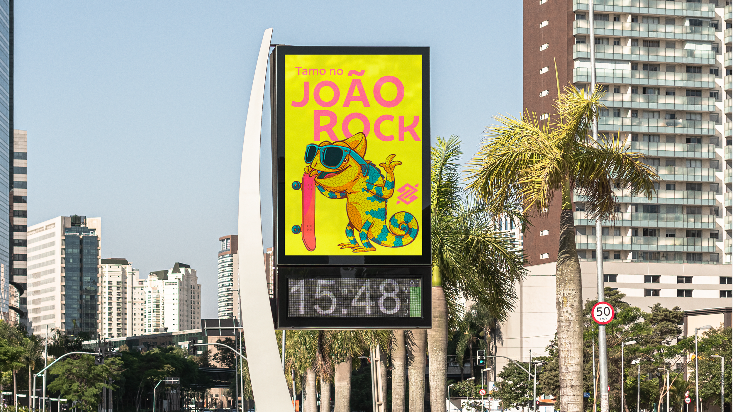
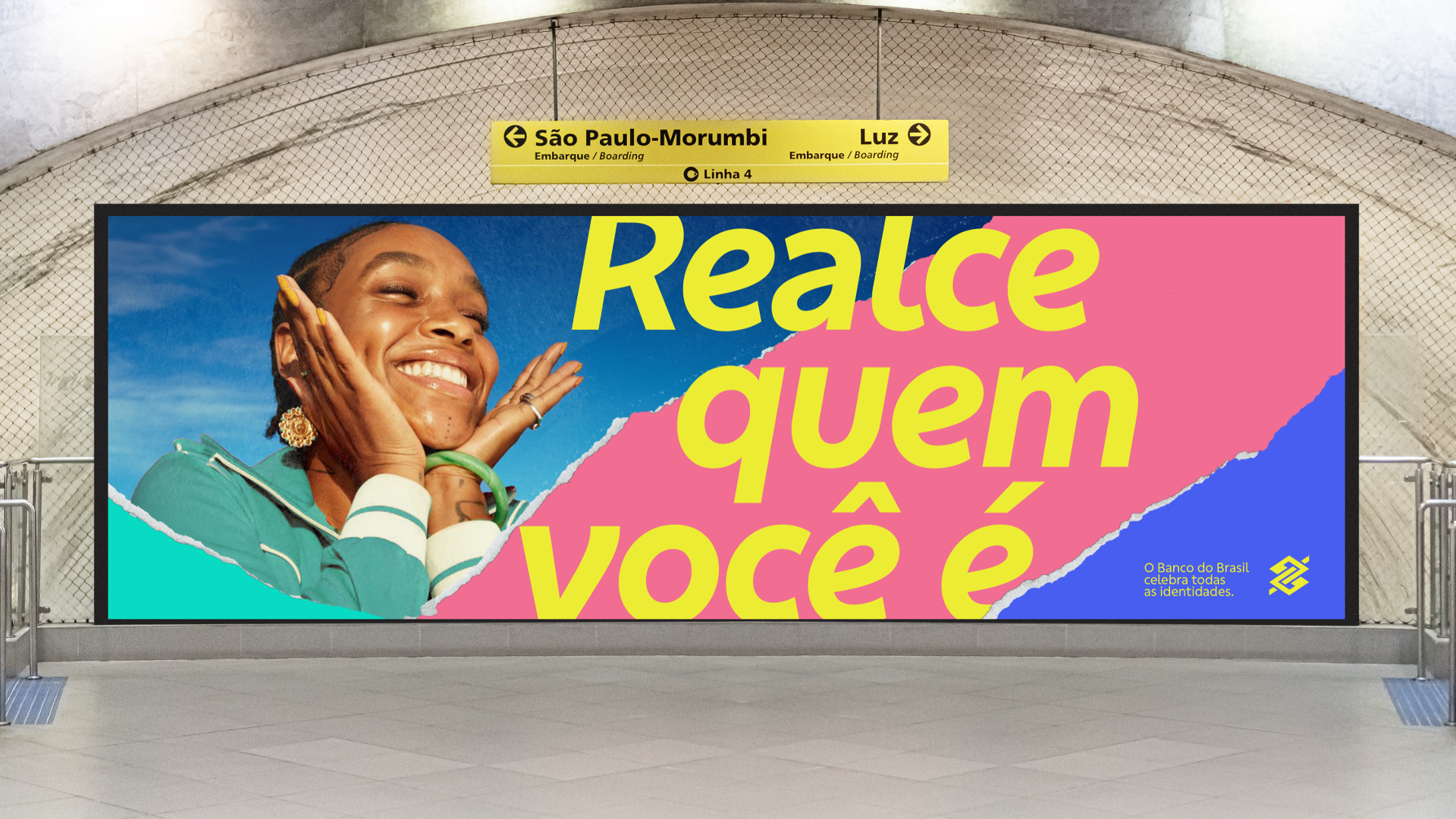
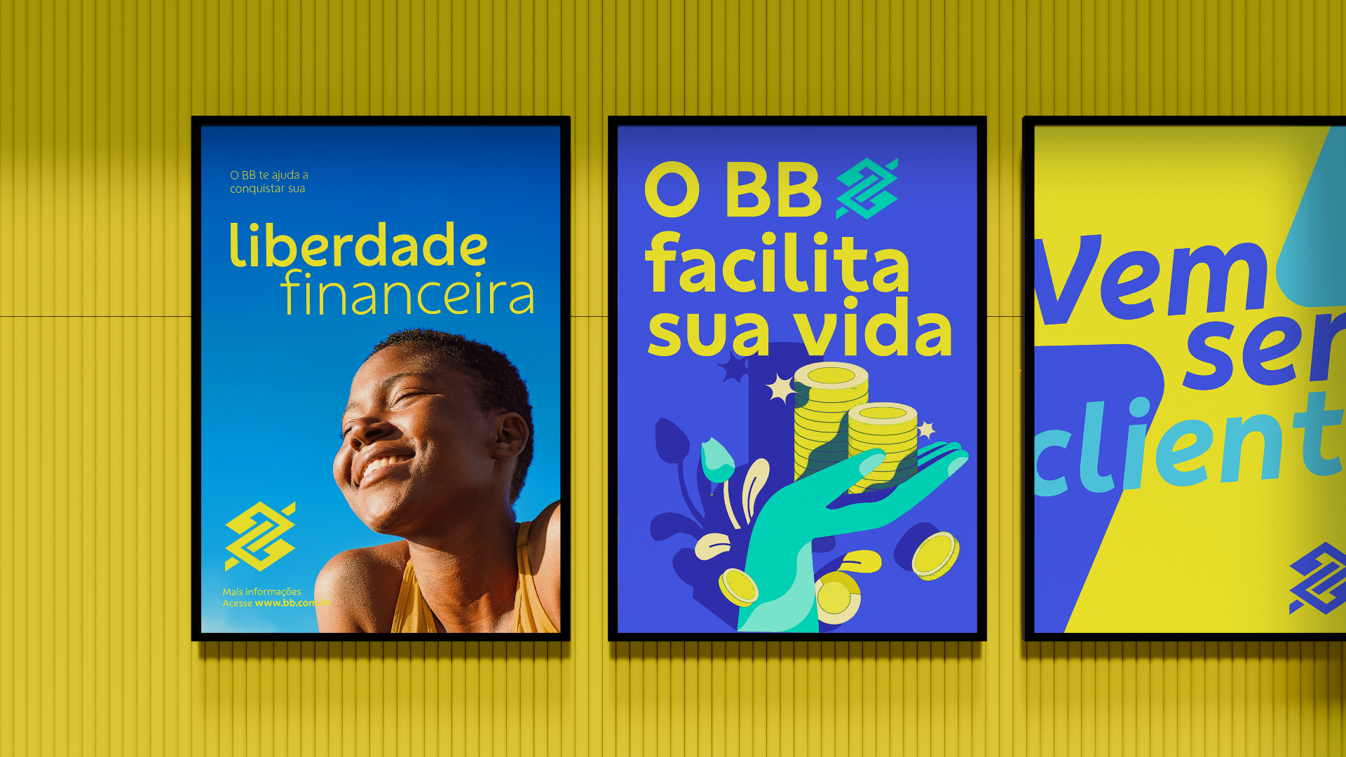
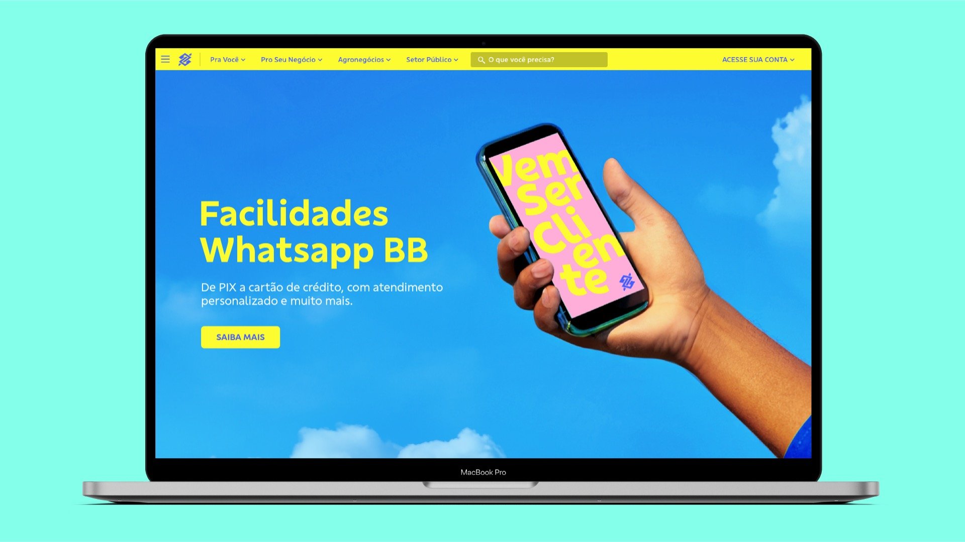
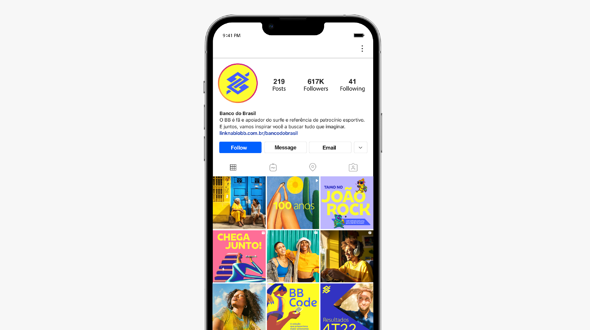
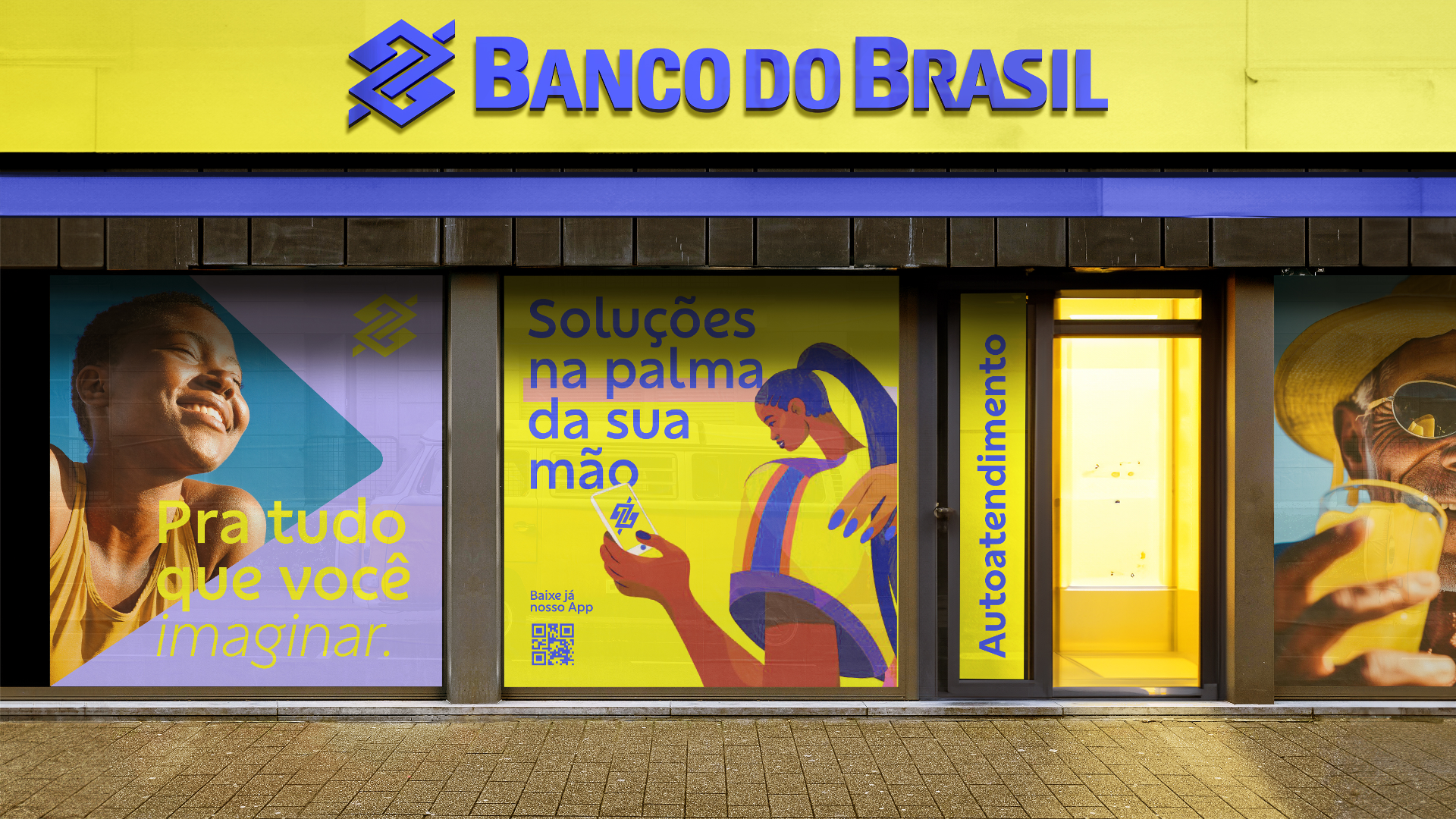
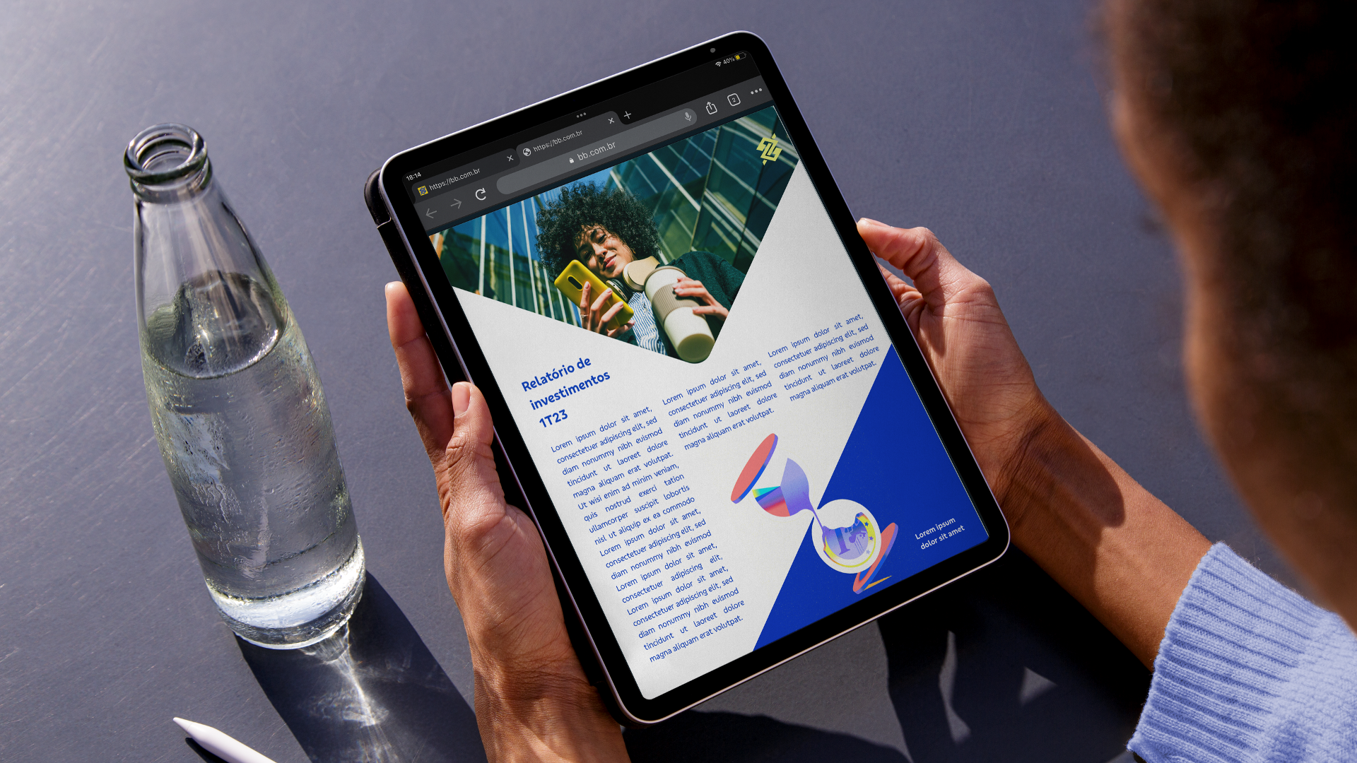
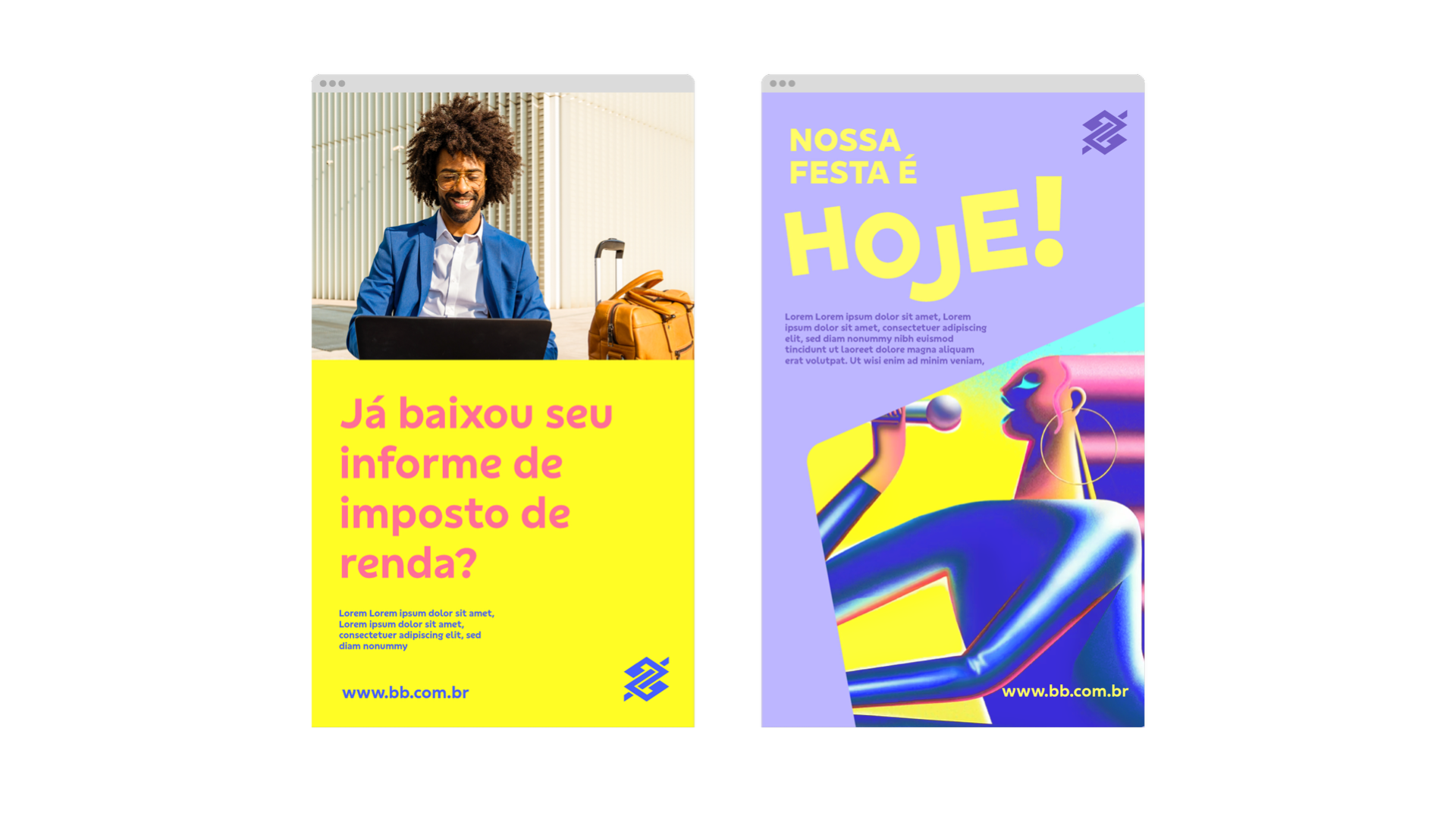
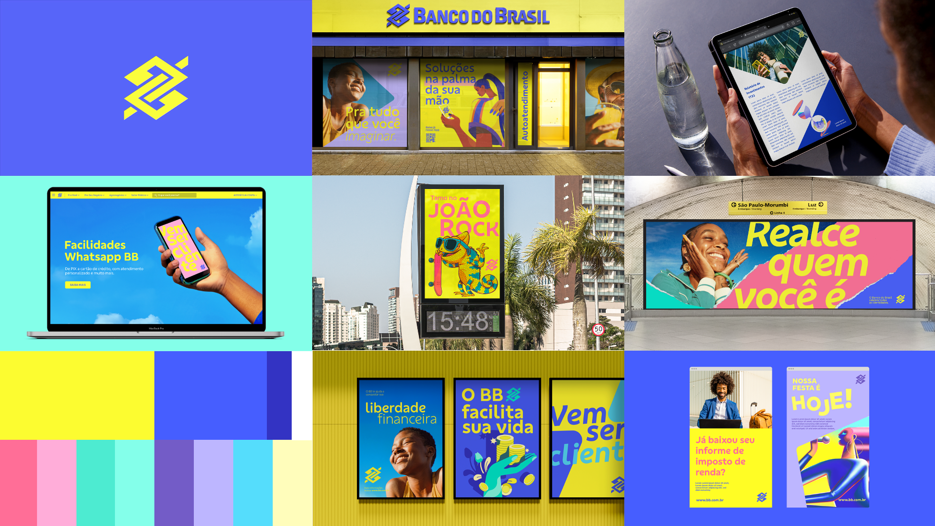
To better connect with new audiences and media channels, an update to Banco do Brasil’s visual identity was required. This process resulted in the development of a more consistent and flexible visual system, with new assets that expand communication possibilities and allow for a more vibrant, contemporary expression.
Concept idea
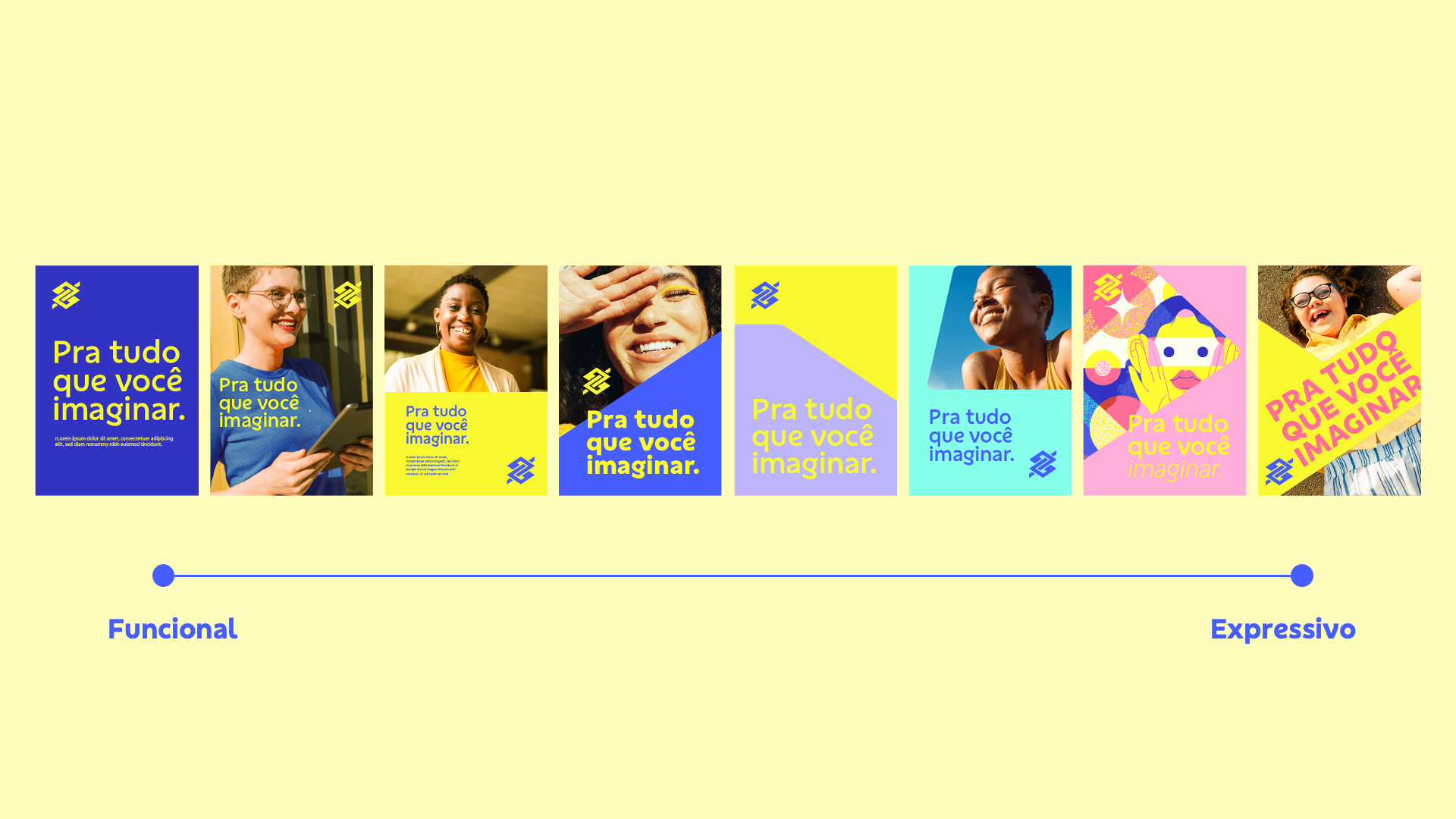
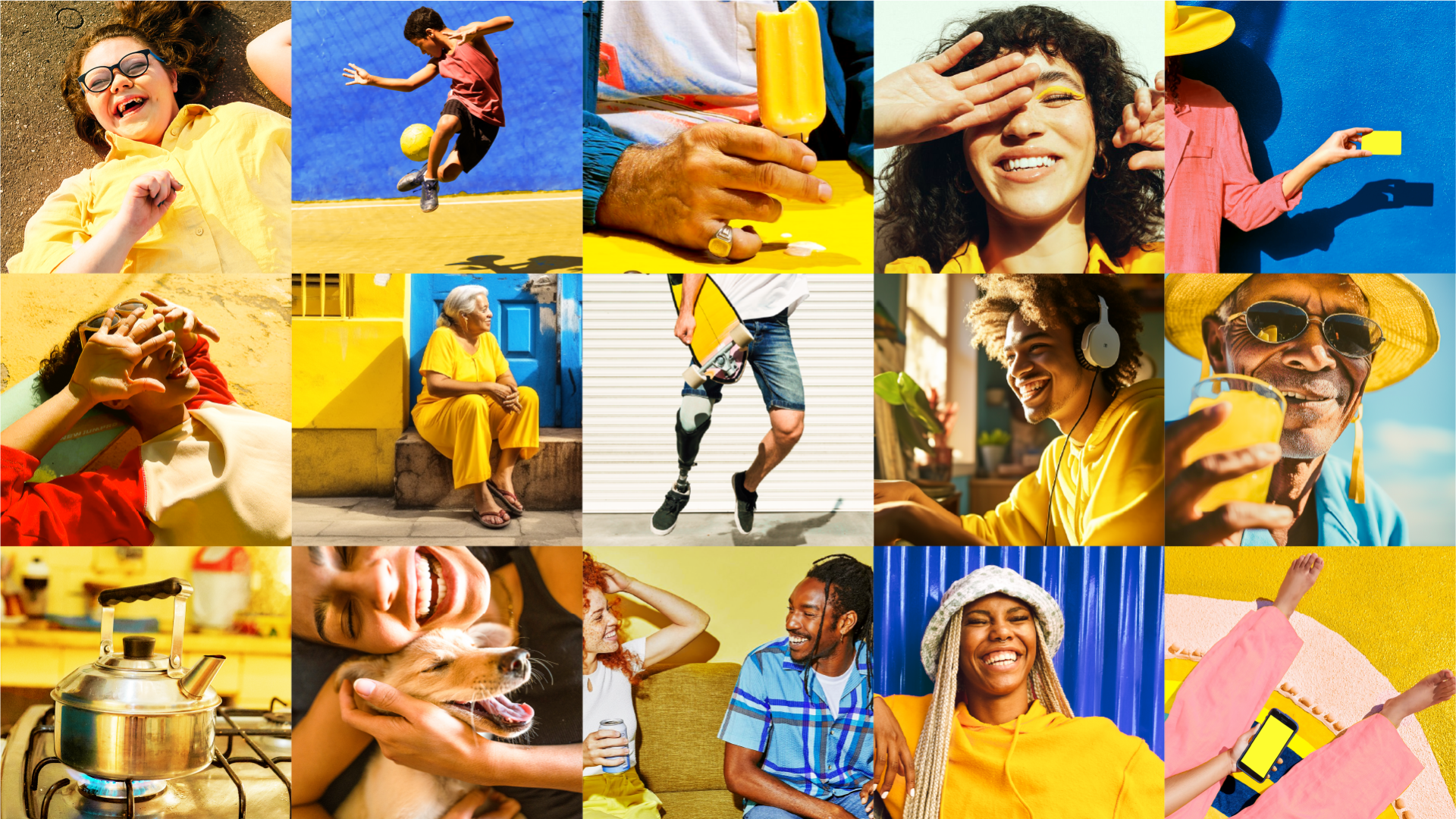
Serotonin is the core concept guiding the entire construction of the new system. It can be expressed in both functional and expressive ways, allowing the visual language to adapt to the different topics and segments in which Banco do Brasil operates.
This principle was applied across all assets—such as typography, photography, and illustration—with a focus on preserving the yellow color and the symbol, elements that strongly reinforce brand recognition. This approach allows the visual language to remain consistent and flexible across multiple media, from institutional campaigns to events and less corporate materials.
Team:
Made with: FutureBrand São Paulo
Creative Direction: Lucas Machado, Rodrigo Valdevite
Lead Design: Carlos Teles
Design: Sofia Ohana, Carlos Teles, Pedro Silva, Gustavo Vasconcelos, Yara Santos
Verbal Identity: Victoria Costa