Natma
About the project
Natma is a movement towards a healthier life through a brand with the potential to promote an affective revolution based on small changes in daily habits.
Our challenge was to the transformation of body and mind through food education and other forms of personal care. The idealized brand should be elastic enough to support anything, from a digital platform that offers online classes, recipes, and other content about cooking and well-being, to a label of natural products of the most diverse types.
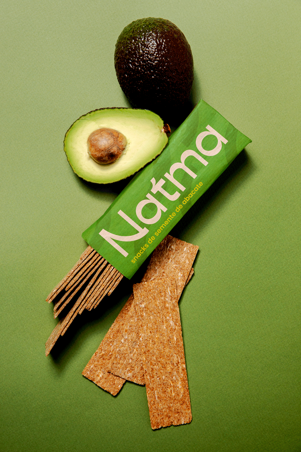
The name was the starting point to create a brand with natural awareness. Thus was born the neologism Natma, which is a mixture between nature, symbolized by the radical “nat” with “atma” - a Sanskrit word that means soul and life principle. We then brought the combination that gave birth to the name that resonates well-being and balance.
Concept Idea
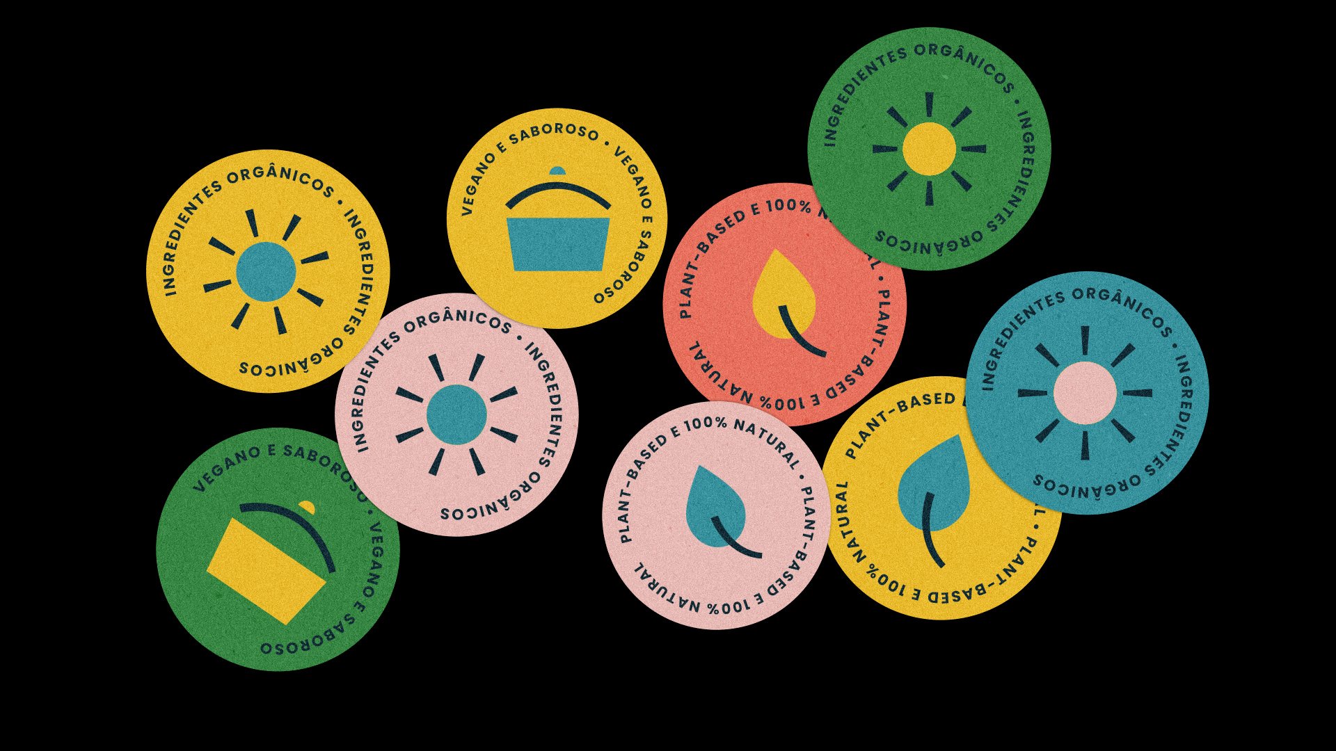
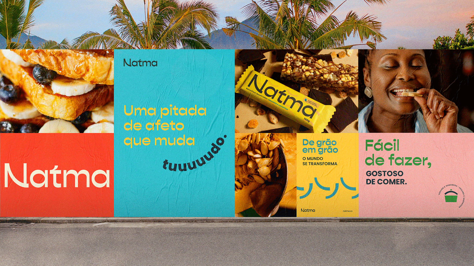
Natma's logo, with its organic forms inspired by bonds and roots, refers to the connection that the brand makes between people and a more natural life. It also alludes to the Sanskrit writing, which inspired the creation of the name. We selected colors that refer to nature and help create an organic atmosphere, without excesses and balanced. Icons and patterns with simplified and organic shapes make up the visual universe, bringing a handmade aspect, combined with a photographic guideline with a strong appeal in flavor and people.
Team
Made with: IN Consultoria
Creative Direction: Caio Campana
Design / Visual Identity: Carlos Teles
Verbal Identity and Naming: Marilia Antunes and Caio Ricciardi