Copa Energia
About the project
Leading changes in Brazil's energy matrix to the world. With this aspiration, Copa Energia emerges to offer sustainable and reliable solutions that bring solid results in the energy sector.
The brand is born from the union of two companies with reputation, tradition and reach in the country. By uniting the stories of Copagaz and Liquigás, a company emerges that brings comfort and care to the lives of millions of Brazilians.
The tradition and impact of Copagaz and Liquigás in their markets revealed the need to create a strong corporate body that would house both brands. Copa Energia was born with this intention and goes beyond: it represents the ambitions of an organization that is ready to expand its operations and strengthen its capabilities in the energy market.
Concept Idea
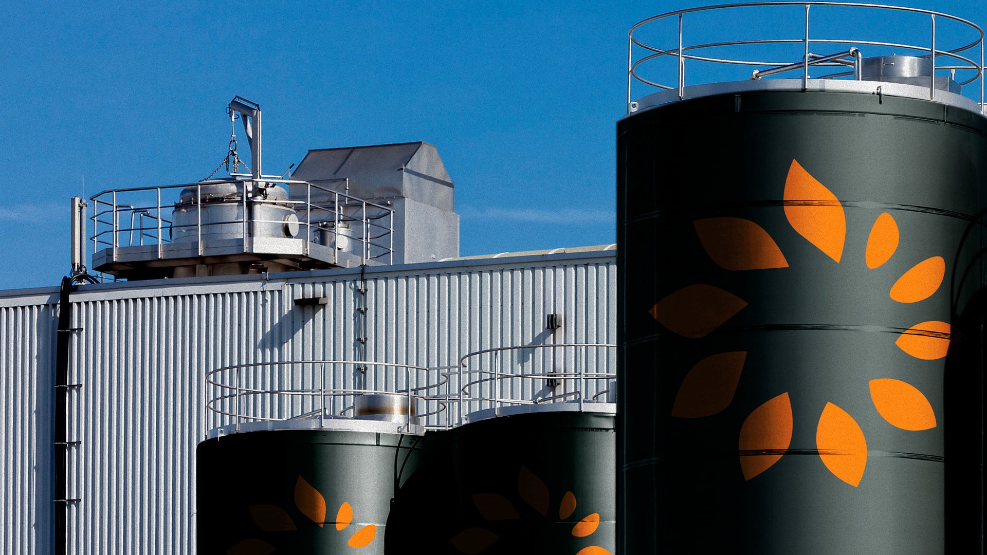
Copa Energia was born with an identity that reflects a confident, flexible and strong organization. Focused on institutional relationships, the brand adopts green that reinforces sustainability and trust.
Copa Energia's tone of voice reflects the brands' willingness to serve their consumers efficiently and with the deep knowledge of those who know the energy market. It balances the simplicity of contact with the knowledge of who leads and transforms an entire segment in Brazil.
Finally, the symbol inspires a cycle that generates and transforms energy through the transitions of its shape, combining movement and evolution, besides that the symbol also represent shapes of clean energy, like solar and wind. The universe brings an orange, vibrant and connected with the energy and humanity of the brand. Together, these elements create a unique identity, which reinforces business capabilities, connection with the world and proximity at all times.
Team
Made with: IN Consultoria
Creative Direction: Caio Campana
Visual Identity: Carlos Teles
Verbal Identity: Marilia Antunes, Caio Ricciardi
Brand Strategy: Ivan Scarpelli, Raquel Carboni, Maria Camila Giannela
Animation: Rafael Barnete


